LondOn to LondOff: How a design choice helps Boris Johnson turn off London
While I was on my flight back home after spending two months in the British capital, minds of undecided Londoners were probably occupied by last-minute evaluations of mayoral candidates. The most popular among those who ran for mayor were the then-present mayor Ken Livingstone, and the great grandson of a Turkish journalist Boris Johnson.
Like most elections of our day, the guy nobody seemed to 'like' and 'want to be elected'—'the guy on the right'—was the winner.
When I came back to the British capital 6 weeks later, ceremonies had been done, offices had changed hands and even urgent drastic measures had already been taken—the most famous being against alcohol use on-board public transport.
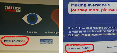
 Interpreting Johnson's statements during his campaign, one could easily see that he saw London as going mad and out-of-track. His first decisions as the mayor only approved this understanding of his politics. What also helped me double-check this approval was a sticker that caught my eye on a red double-decker.
While Livingstone was on duty, and I was taking at least four buses a day, I had become very familiar with the stickers that read LondOn. I would see them every now and then when I lifted my head up from my book and had a brief eye-rest. I have to admit that this kind of color choice in the typesetting of the capital's name jazzed me up a little, in other words, turned me on.
However, this time, Johnson was in control and I was taking a city bus from where the airport shuttle had left me. Involuntarily I stumbled upon the stickers on top of the bus window and BAM! London was no more LondOn.
Call it designer over-sensitivity or the careful eye of the outsider, what matters is that this choice of color use—what seemed like a minor detail about graphic design—served the purpose. Along with the alcohol ban, I, as the other passengers, had become a good boy. Transport in London was much safer now.
Read more!
Like most elections of our day, the guy nobody seemed to 'like' and 'want to be elected'—'the guy on the right'—was the winner.
When I came back to the British capital 6 weeks later, ceremonies had been done, offices had changed hands and even urgent drastic measures had already been taken—the most famous being against alcohol use on-board public transport.
 Interpreting Johnson's statements during his campaign, one could easily see that he saw London as going mad and out-of-track. His first decisions as the mayor only approved this understanding of his politics. What also helped me double-check this approval was a sticker that caught my eye on a red double-decker.
While Livingstone was on duty, and I was taking at least four buses a day, I had become very familiar with the stickers that read LondOn. I would see them every now and then when I lifted my head up from my book and had a brief eye-rest. I have to admit that this kind of color choice in the typesetting of the capital's name jazzed me up a little, in other words, turned me on.
However, this time, Johnson was in control and I was taking a city bus from where the airport shuttle had left me. Involuntarily I stumbled upon the stickers on top of the bus window and BAM! London was no more LondOn.
Call it designer over-sensitivity or the careful eye of the outsider, what matters is that this choice of color use—what seemed like a minor detail about graphic design—served the purpose. Along with the alcohol ban, I, as the other passengers, had become a good boy. Transport in London was much safer now.
Labels: color, graphic design, london, transport, urban
Read more!

